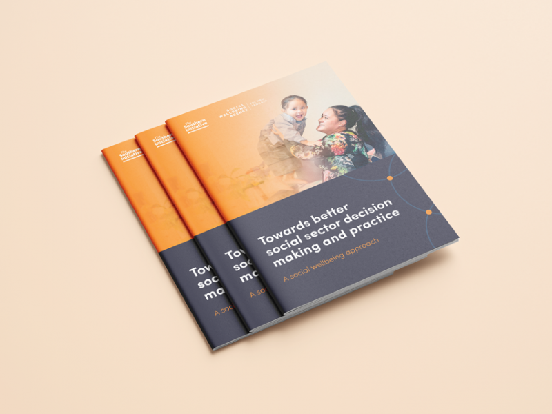
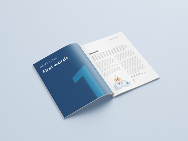
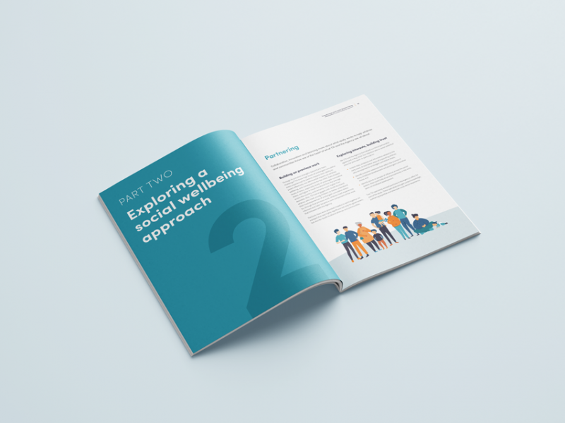
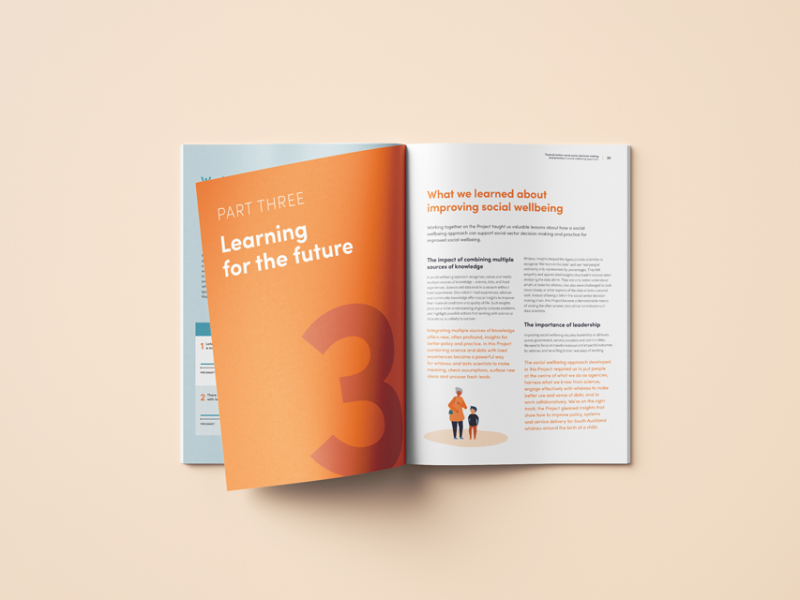
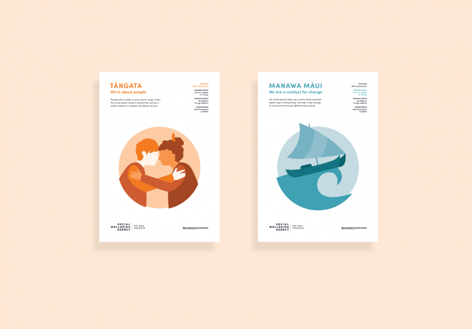
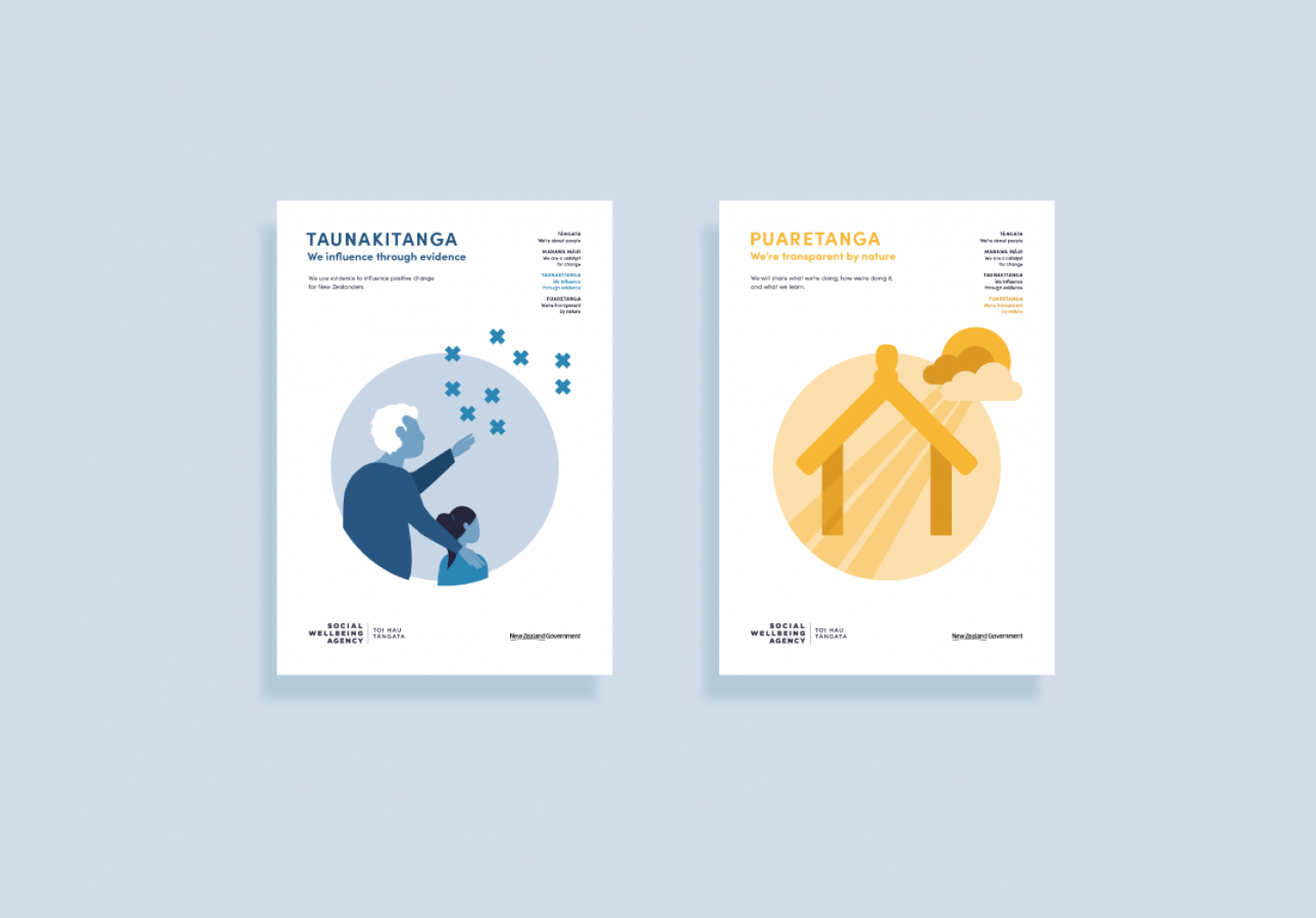
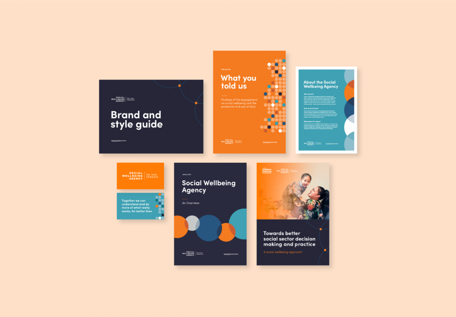
We were asked to update The Social Wellbeing Agency’s (SWA) brand to reflect their new name and mandate – “Together we can understand and do more of what really works, for better lives”. The Agency asked for a new identity that conveyed its people, values, and purpose as well as giving them a flexible and dynamic brand that would embrace their different areas of work.
We worked on
- Illustration
- Brand identity
- Strategy
- Spatial design
- Print & digital design
The brand
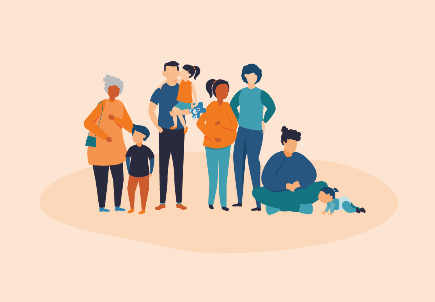
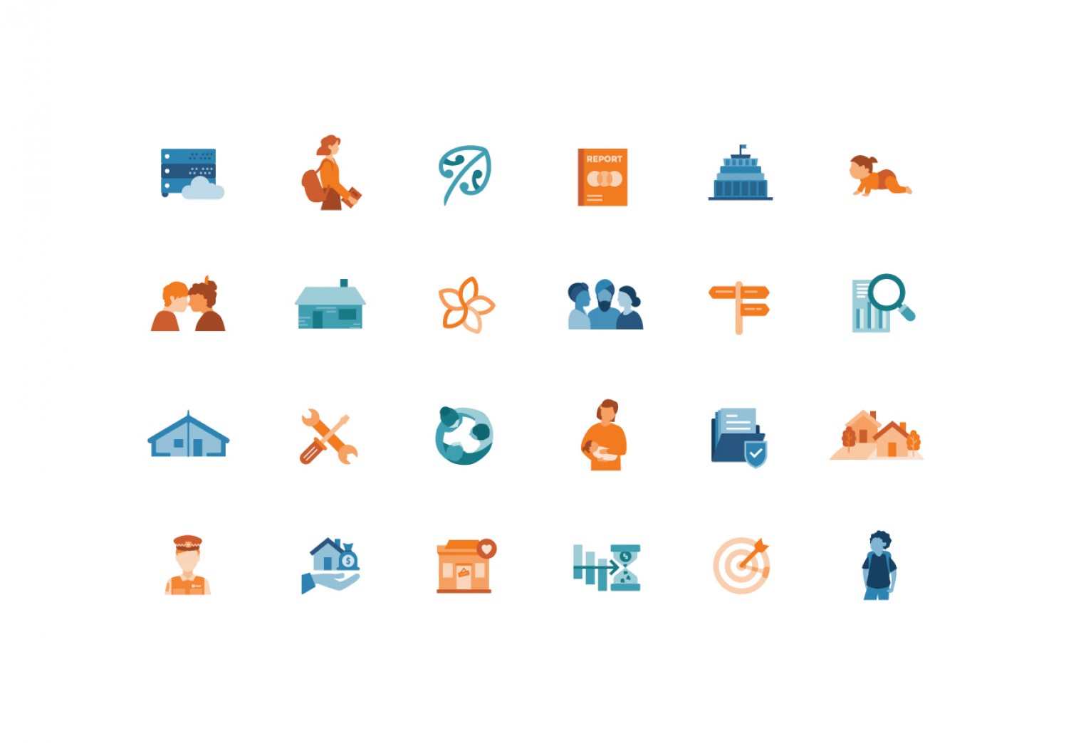
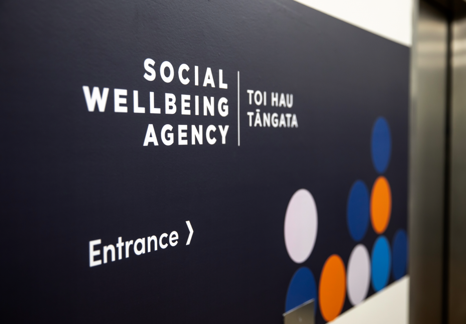
The brand we delivered represents SWA by acting as both identifier and marker of quality. The logo itself is simple in its typographic treatment, highlighting the agency and their gifted name in te reo Māori, Toi Hau Tāngata. The colours we developed are recognisable aspects of the brand identity – they are bold and bright to reflect the diversity of the social system and the Agency’s audience. The colours we chose amplify the suite of graphic tools (illustrations, icons, and photography) we created that makes the brand recognisable with a unique look. They act as an extension of the mission and enhance SWA’s storytelling.
